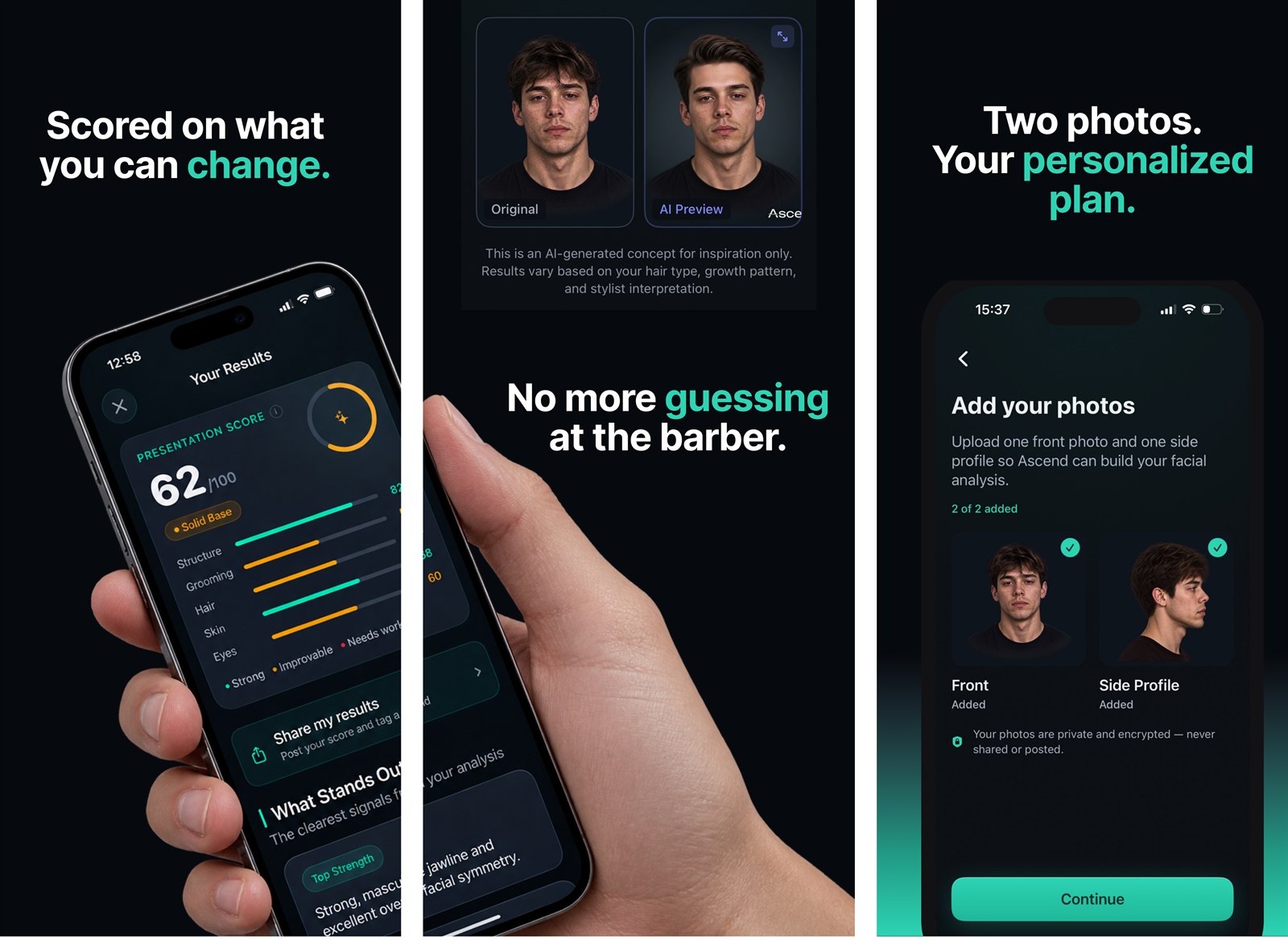
Men's Grooming · iOS · App Store Screenshots & ASO
Ascend — screenshots that sell a coach, not a judge
An 8-screen App Store set and ASO strategy for an AI face-analysis app for men — built to earn the install in one of the App Store's most crowded, look-alike categories.
The challenge
Ascend launches into one of the most crowded, look-alike categories on the App Store. Every competitor promises a "rating" and leans on the same aggressive before/after visuals. Ascend needed a store presence that felt different — trustworthy, premium, and clearly built for men — while staying fully within Apple's screenshot rules and avoiding the medical or guaranteed-outcome claims the category is full of.
The category is full of face-rating apps that judge looks. Ascend is about being the best version of yourself — and the listing had to say that in three swipes. The brief wasn't just "make it pretty." It was: help the right person, searching the right words, understand what the app does and tap install.
Positioning
Before designing a single screen, I reframed the message. The category asks "how attractive are you?" — Ascend asks "how much of your potential are you actually using?" The score isn't a verdict on your genetics; it's a starting point for the things you can actually change: skin, hair, grooming, brows. That shift — competing with a better-groomed version of yourself, not with other men — became the backbone of every headline.
Strategy — ASO first, design second
I started with the keywords, not the canvas. Merging keyword exports from five competitors (≈660 terms), I filtered by relevance to the app first, then difficulty (targeting a winnable ~30), then traffic.
That surfaced a clear play: anchor the Title and Subtitle on winnable long-tail terms (like "ai hair analysis," competition ~30) while parking high-competition category terms in the 100-character keyword field where they still work but don't dictate the messaging. I delivered this as a client-ready report with traffic, competition, and relevance for each recommended term.
A/B testing the hook
The first screenshot does the heaviest lifting — it's what a searcher sees first. So I designed headline variants for screen 1 and tested them against the keyword strategy: one led with the exact search term, one with the pain point, one with the feature — to learn which one earns the tap.
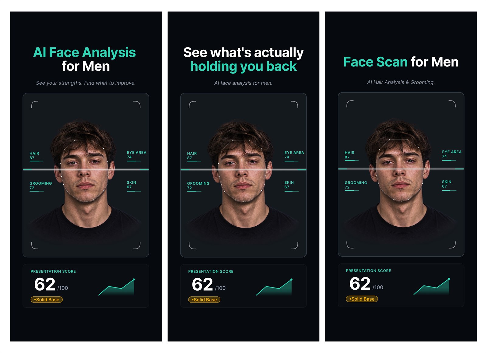
Screen 1 variants — keyword-led ("AI Face Analysis for Men"), pain-led ("what's actually holding you back"), feature-led ("Face Scan for Men").
The story, screen by screen
On the store, people swipe. So after the hook, the screens are sequenced like a story — each one answers the question the last raised, pulling the reader to the next:
- Hook — screen 1. "AI Face Analysis for Men." Says what it is and who it's for, led by the keyword. Raises the question: analyse what, exactly?
- Reframe — screen 2. "Scored on what you can change." The score isn't a verdict on your genes; it's a starting point you can act on. OK — so how does it help me?
- The payoff they picture — screen 3. "No more guessing at the barber." The AI hairstyle preview: your original vs. a styled you.
- Zero friction — screen 4. "Two photos. Your personalized plan." Two photos in, private and encrypted — it's this easy.
- Always a next move — screen 5. "Always know what to work on next." The roadmap turns the score into clear, ranked actions.
- Personal, not generic — screen 6. "Advice based on your own results." An AI coach that speaks to your scan, not boilerplate tips.
- The transformation + the close — screen 7. "Follow your plan. See the difference." The confident version of you — then "Your first scan is free" removes the last risk right at the decision point.
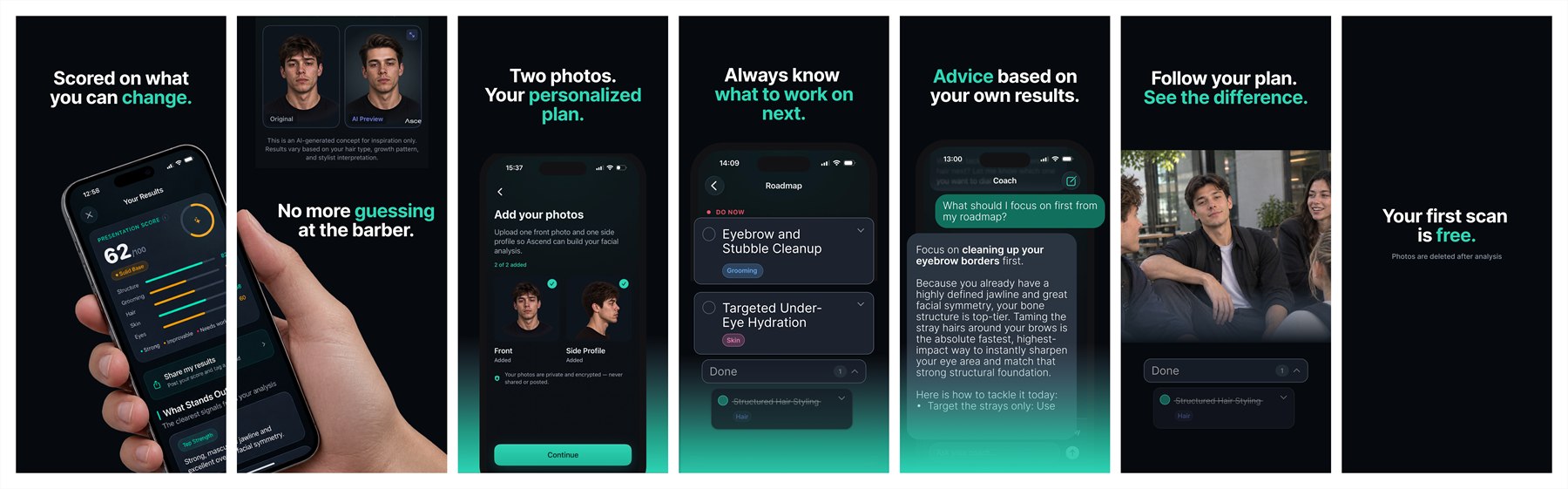
Screens 2–7 in order → scroll to follow the sequence. Every headline leads with an outcome; one teal punch-word keeps the rhythm.
Process
- Discovery. Mapped the app's real features — a five-category scorecard, guided photo capture, hairstyle recommendations by face shape, an AI coach, a progress roadmap — and its audience.
- Keyword research. The five-competitor merge and long-tail strategy, written up as an ASO plan for Title, Subtitle, and the keyword field.
- Narrative. Mapped an 8-screen story built like a commercial: hook → what makes it different → the features users love → free-trial close.
- System. Built the screenshot template in Figma at 6.9" (1320×2868) with a dark, premium palette (#0A0D12 card, #2DD4B4 teal accent) and one teal "punch word" per headline for a consistent rhythm.
- Compliance audit. Pruned anything Apple flags: before/after framing, medical or clinical language, guaranteed outcomes. I also ruled out jawline, mewing, and symmetry — traits you can't change without surgery — and kept the focus on controllable wins.
- Design. Mapped Ascend's real app screens into the layout and designed each of the eight, pairing outcome-focused copy with lifestyle imagery so the set reads like a brand, not a spec sheet.
- Iteration. Worked through client feedback directly in Figma: sharpened copy to be outcome-led rather than feature-led, kept "AI" to the first screen so it never felt gimmicky, surfaced the AI hairstyle-preview feature, aligned the connected/panorama shots, and matched the score colour to the live app.
- Delivery. Shipped upload-ready PNGs at 1320×2868 plus the editable Figma source, with the exact sizes and file setup the client needed to publish.
Design decisions that mattered
- Copy as the product. On the store, the words are read before the design. Every headline leads with an outcome the searcher wants, not a feature the app happens to have.
- Restraint with "AI". The first screen establishes it's an AI app; repeating it everywhere cheapens it. Naming it once made the whole set feel more considered.
- Honesty over hype. No before/after, no promises — just a clear, present-state score and controllable next steps. It's what keeps the app compliant and what makes it trustworthy.
Outcome
"Issaya delivered beautiful, eye-catching designs and was more than happy to address any feedback I had on my app store screenshots. Highly recommend!"
— Client review · Upwork
The client approved the set, handled the final export himself, and asked to keep me in mind for future work — including localizing Ascend into other languages. The work reads as one cohesive system: research-backed, on-brand, and built to earn the tap in a crowded store.
Launching in a crowded category and need a store presence that earns the tap?
Let's talk