Brand Identity · F&B / Retail
Boba Cloud
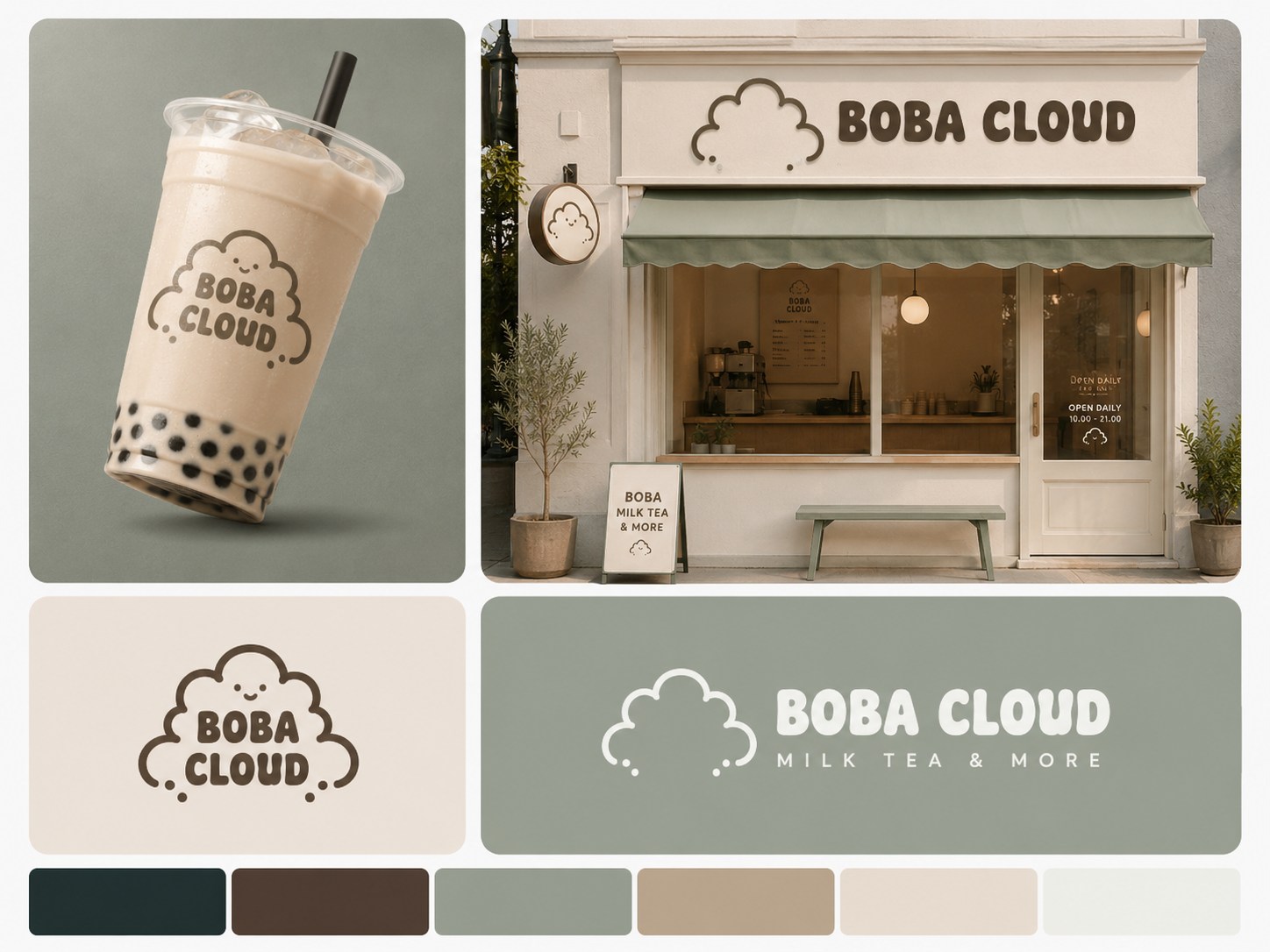
A cozy, kawaii-minimal identity for a bubble tea brand — designed to feel like a five-minute escape, and to be impossible to scroll past.
The challenge
Bubble tea is a noisy, scroll-past kind of market. To stand out, a brand has to feel warm the second you see it — whether that's a thumbnail-sized profile picture or the sign above the door.
Boba Cloud needed to feel like a small, cozy treat: soft, playful, a little bit cute. But it still had to hold its own as a premium brand — inviting, never childish. The whole challenge lived in that balance.
The approach
- A mascot you want to hug — Designed a smiling cloud character that gives the brand personality and warmth — something people recognize and screenshot, not just a logo.
- A palette built to feel like the product — Sage green, milk-tea cream, and soft neutrals — colors that read as calm and cozy while still looking clean and premium.
- A wordmark with personality — Rounded, bold lettering that keeps the playful "kawaii" feel without tipping into looking childish.
- One identity, every surface — Applied consistently across cup design, storefront signage, awnings, and social — hand-illustrated the core mascot and wordmark, then used AI tools to generate realistic real-world application scenes, so the brand's feel could be tested and shown across every touchpoint before a single physical asset was made.
The result
A brand identity built to be recognized, remembered, and chosen — cozy enough to feel like a break in your day, and consistent enough to build trust at every touchpoint:
- A mascot that makes the brand instantly likeable and shareable
- A calming, premium palette that stands out in a crowded category
- A cohesive look that holds up from a cup sleeve to a storefront
- An identity built to turn passersby into regulars
Want a brand people fall in love with at first sip?
Let's talk