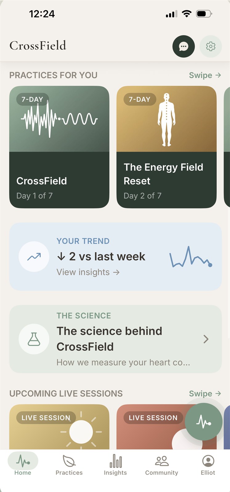
CrossField (UI/UX Design)
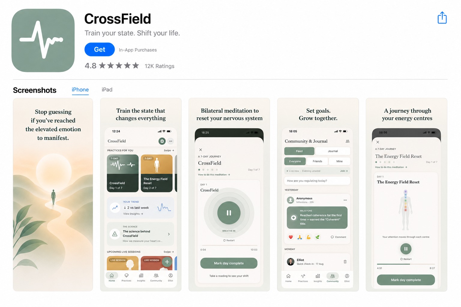
UI/UX Design · Wellness App
CrossField
A wellness app that shows users if their meditation is actually working — backed by real HRV science.
The challenge
Meditation apps are everywhere, but most give no real proof it's working. CrossField needed an interface that felt as credible as the science behind it — HRV (heart rate variability) technology, measured through the phone's camera — while staying calm, simple, and approachable for everyday users just starting a practice.
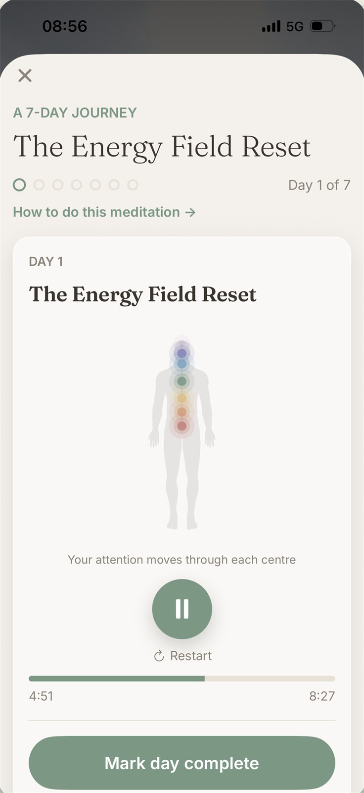
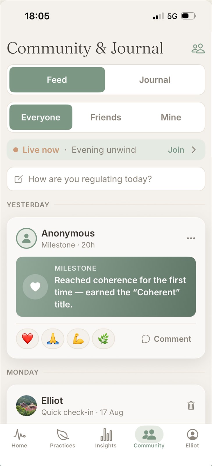
A calm, health-forward interface built on real HRV science
The approach
- Design for trust. A clean, minimal interface that signals real health tech, not a gimmick — because users are trusting it to read their body.
- A calming color system. Built a soft, health-focused palette that feels clinical enough to trust and calm enough to meditate with.
- Simplicity over complexity. Reduced the experience to its essentials — place a finger, follow the guide, see your result — so the science stays invisible and the experience stays easy.
- UI that matches the outcome. Designed the interface to make progress and results feel clear and motivating, not clinical or confusing.
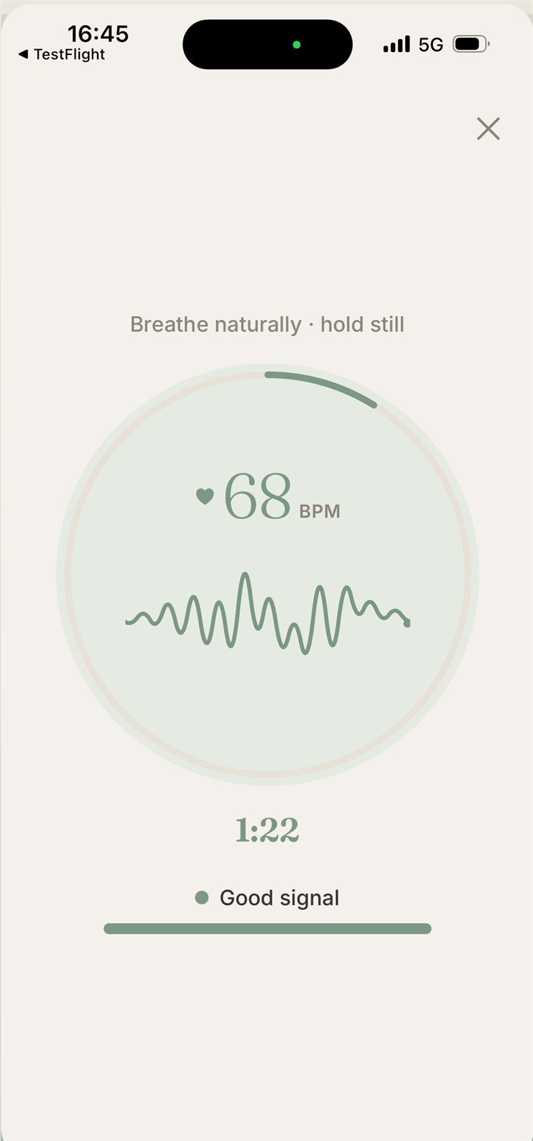
Live HRV Scan
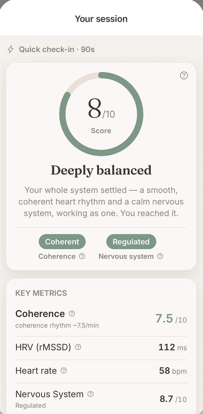
Result
Key app screens — running your live HRV scan and reading your results
The result
A wellness app interface that makes real biometric science feel simple, calming, and trustworthy:
- A minimal, health-forward look that builds user trust
- A calming palette suited to a meditation-first experience
- A simple, guided flow that makes advanced tech feel effortless
- Design that turns HRV data into something users actually want to check
Want an app interface that makes complex tech feel simple?
Let's talk