CrossField (UI/UX Design)
UI/UX Design · Manifestation App
CrossField
A manifestation app that helps users reach a coherent, elevated emotional state — and proves, through real HRV science, that they've actually got there.
The challenge
Manifestation apps ask users to "feel the elevated emotion" — but most give no proof they've reached it. CrossField needed an interface that made an abstract, almost spiritual idea feel credible and measurable — using HRV (heart rate variability), read through the phone's camera, to show that the coherent state is real — while staying calm, simple, and welcoming for people just starting a practice.
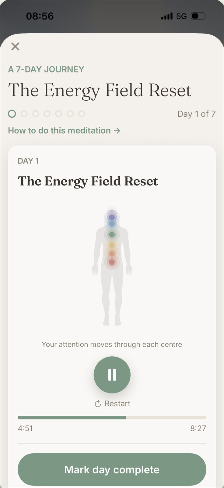
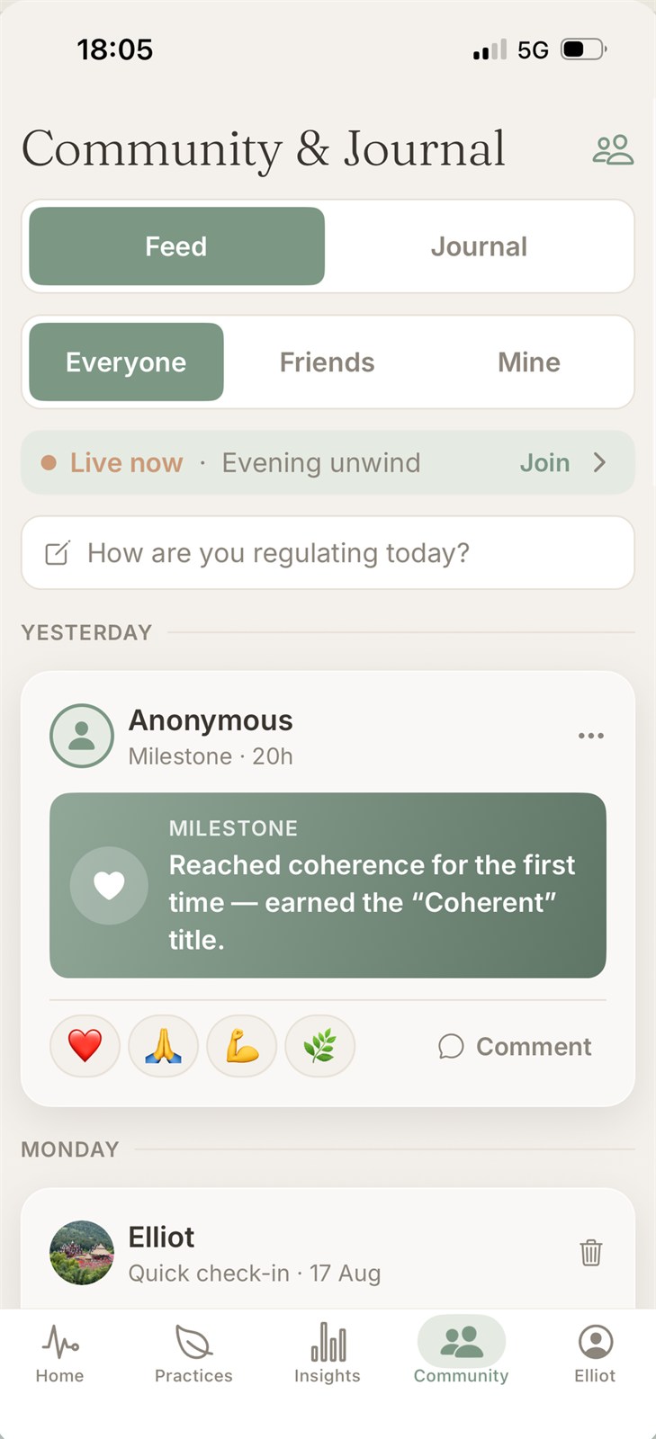
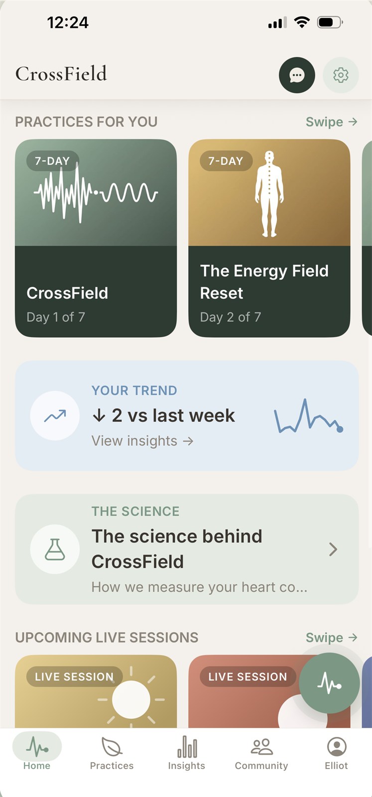
A calm, credible interface — an abstract idea grounded in real HRV science
The approach
- Design for trust. A clean, minimal interface that signals real, credible tech — not woo, not a gimmick — because it has to make an abstract idea feel measurable.
- A calming color system. Built a soft, health-focused palette that feels clinical enough to trust and calm enough to meditate with.
- Simplicity over complexity. Reduced the experience to its essentials — place a finger, follow the guide, see your result — so the science stays invisible and the experience stays easy.
- UI that matches the outcome. Designed the interface to make progress and results feel clear and motivating, not clinical or confusing.
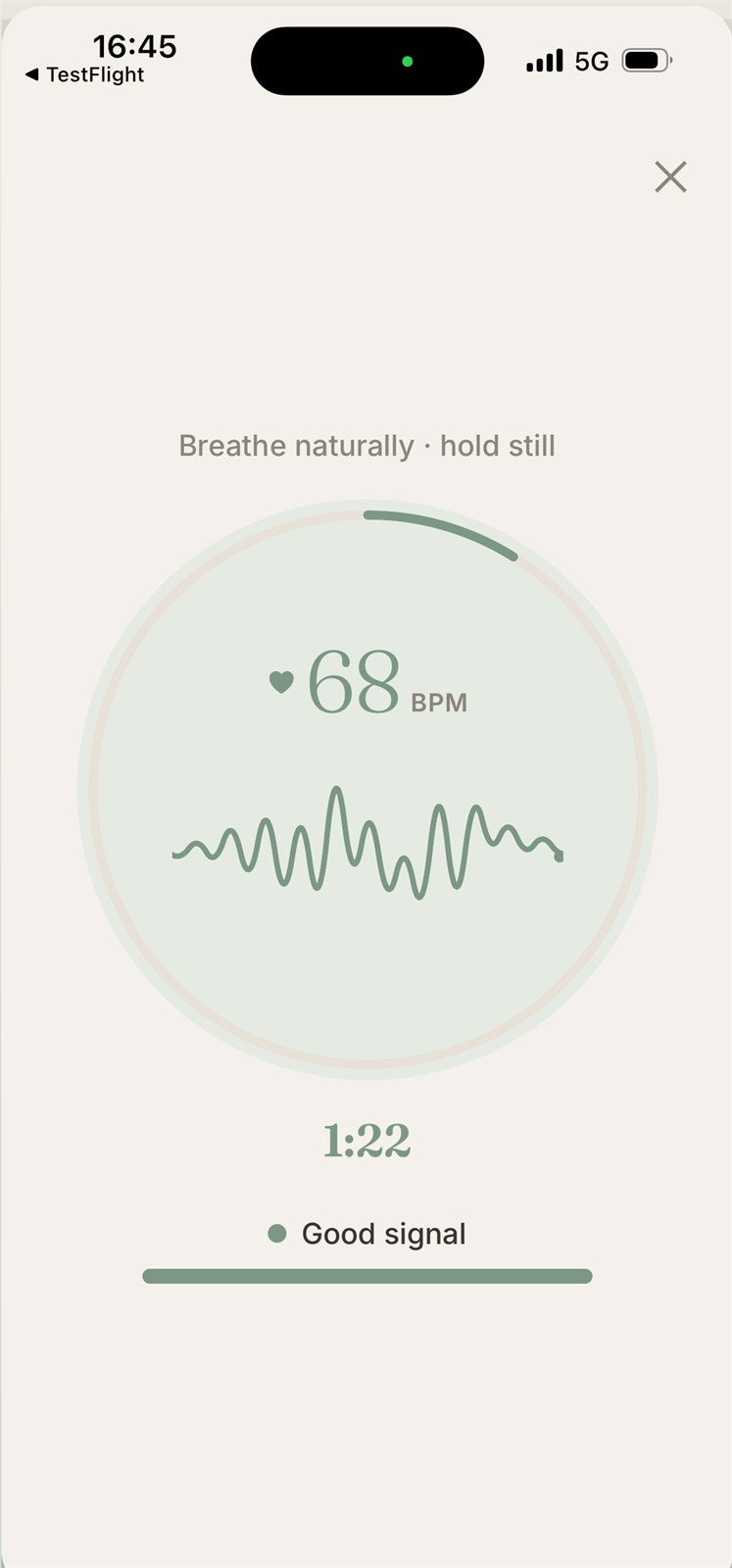
Live HRV Scan
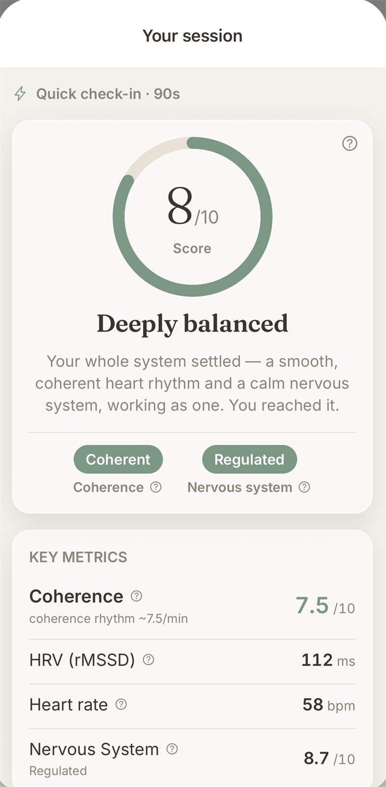
Result
Key app screens — running your live HRV scan and reading your results
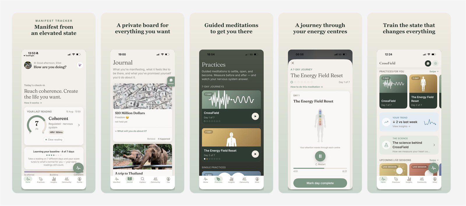
App Store screenshots, designed to convert
A store listing has seconds to work, so every panel here is a research-backed decision, not a guess — driven by keyword and competitor data (and CrossField's own TestFlight feedback):
- Manifest from an elevated state — the keyword. Keyword research first: I confirmed the exact term this audience searches and can realistically rank on, then led with it in big text (badged Manifest Tracker) so search intent and headline match the instant it appears.
- A private board for everything you want — the difference. After scanning competitors, I led with the one thing they don't have. Most manifestation apps sell the vague promise; CrossField shows a private board you actually build — plus a state you can measure ("Coherent · HRV 160ms"), proof instead of a vibe.
- Guided meditations to get you there — the mechanism. The method that makes the promise believable: guided sessions that move you into the state, measured before and after.
- A journey through your energy centres — the rave feature. My starting bet for the experience users love most (the Energy Field Reset). I'd confirm this against real reviews and TestFlight feedback before locking the order — a hypothesis to validate, not an assumption.
- Train the state that changes everything — the promise. Closes by tying every screen back to the one payoff users came for.
Still to test: a real human face on one panel (faces stop the scroll fastest in a row of phone mockups) and an Apple feature badge if CrossField ever earns one.
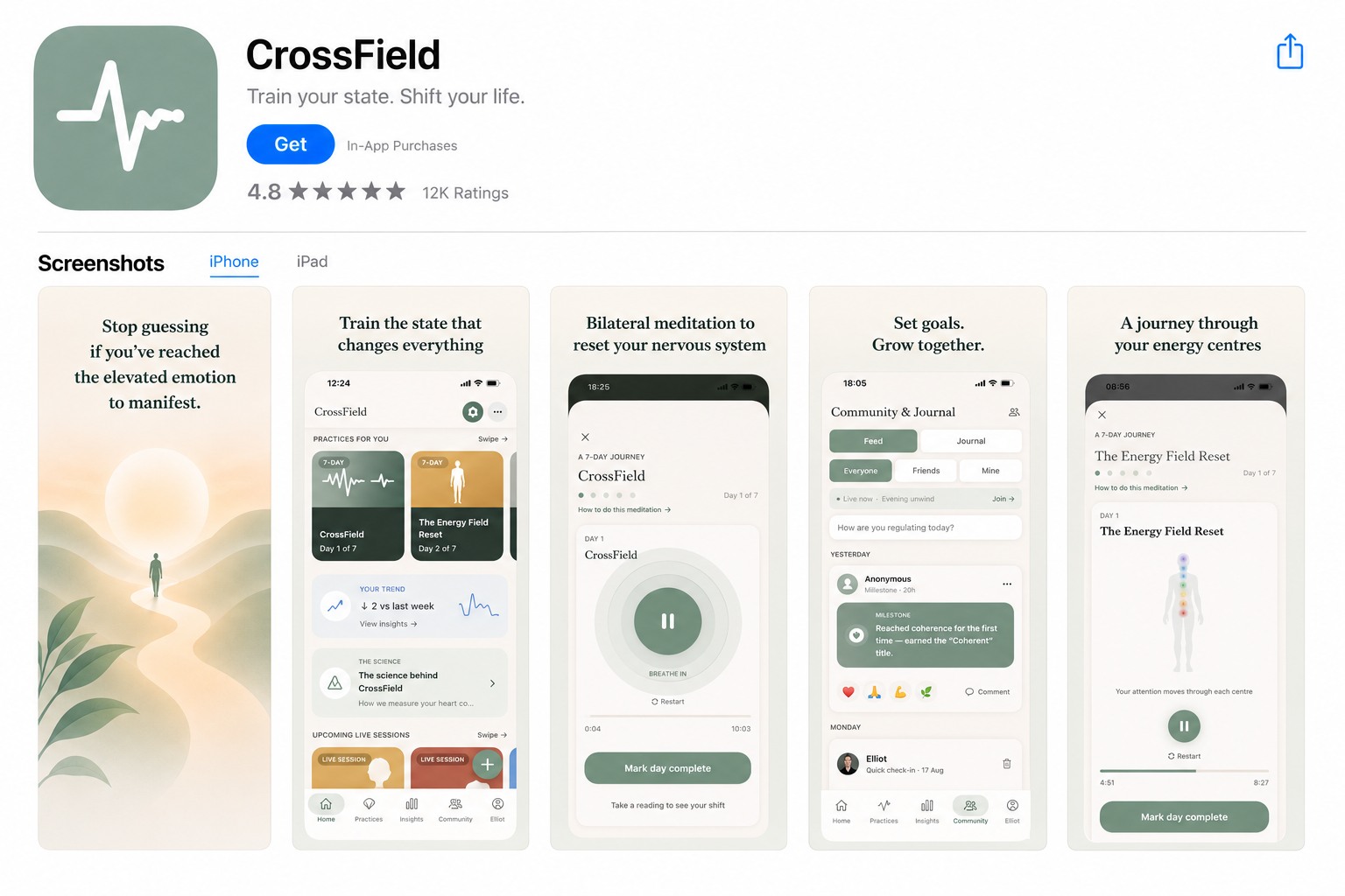
The same panels, assembled into the live App Store listing.
The result
A manifestation app interface that makes an abstract idea feel real, calm, and trustworthy — proof you've reached the state, not just another promise:
- A minimal, credible look that grounds a spiritual idea in real trust
- A calming palette suited to a meditation-and-manifestation practice
- A simple, guided flow that makes the HRV science feel effortless
- Design that turns coherence data into proof users actually want to check
- A store-ready 5-panel App Store screenshot set with headline copy
Want an app interface that makes complex tech feel simple?
Let's talk