UI/UX · Data visualisation · Concept 2026
Flowdesk
A live 3D view of how customer requests move through an office — an operations dashboard you can walk through.
The problem
Most small businesses can't see where a customer's message waits. They see an inbox at one end and a reply at the other. Everything in between — who picked it up, how long it sat in a tray, why it got stuck — is invisible. Dashboards tend to answer this with tables of averages, which tell a manager that something is slow but not where or why.
The idea
Show the office itself. Every request is an envelope carried by a small delivery robot. It arrives in the inbox, gets sorted, lands in someone's tray, gets answered, sometimes checked, and leaves as a reply. You can watch the whole office at once, or click any envelope and follow it from start to finish.
The journey of one request
- Inbox. An envelope drops into the inbox.
- AI sorting desk. A delivery robot carries it to the AI desk, which sorts it almost instantly.
- The right team. It goes to Sales, Support, Finance or Design — to whoever has the shortest queue.
- Answered. The person types a reply, with a progress ring above their head and a screen that lights up while they work.
- Quality check. Finance and Design work passes the quality check desk first.
- Replies sent. The envelope flies out of the office.
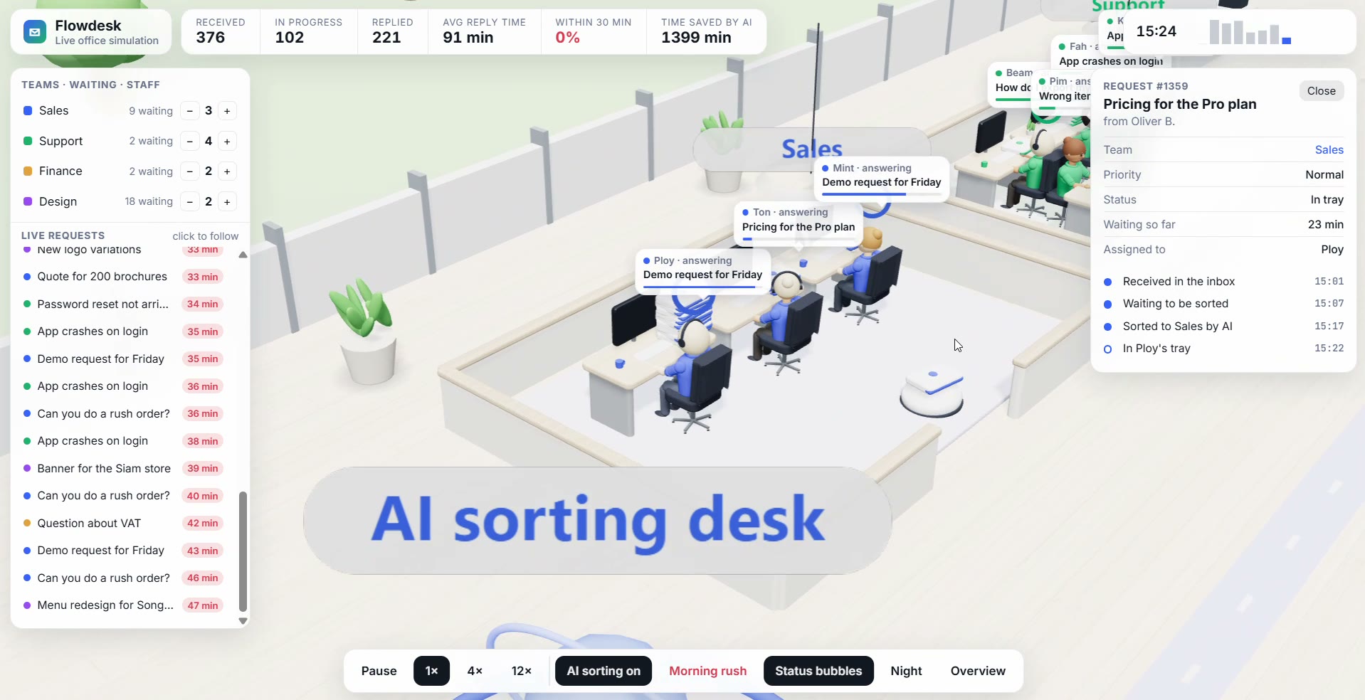
Follow one request — the camera rides along, and the timeline answers "why did this take 40 minutes?"
Design decisions
- Follow one request, not an average. Click an envelope and the camera rides along with it. A timeline records every step with a time stamp, so "why did this take 40 minutes?" has a visible answer.
- One number, one question. The top bar holds six numbers, each answering a single question a manager actually asks: how many came in, how many are open, how fast we reply, and how many we answered within 30 minutes.
- Let people test "what if". Add or remove someone from a team, trigger a morning rush, or switch the AI sorting desk off. The queue reacts within seconds, so decisions about staffing and automation can be felt, not just calculated.
- Colour only when it means something. Each team has one colour, used on its desks, envelopes and screens. Red appears only when a request has waited longer than 30 minutes, so problems stand out without a legend.
- Calm by default, detail on demand. From far away the office reads as a simple map. Detail — people typing, envelopes stacking in trays, heads turning toward an arriving robot — rewards a closer look without cluttering the overview.
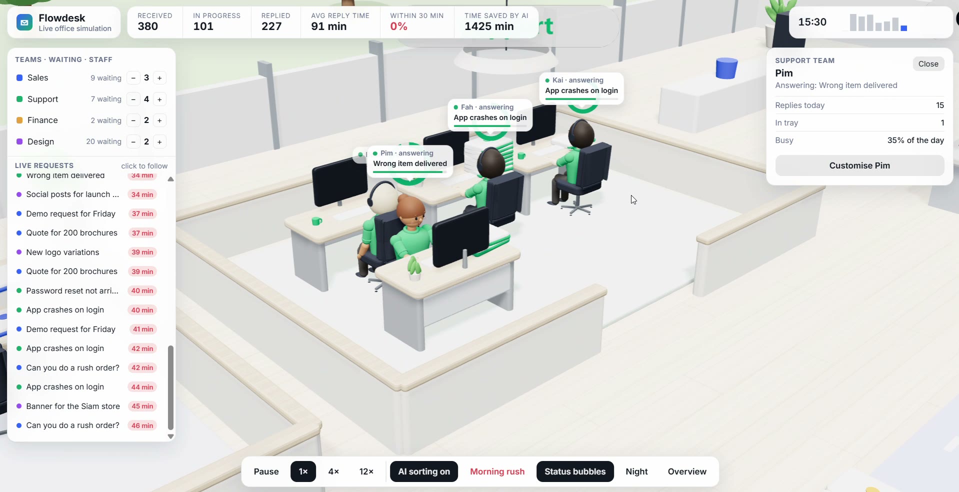
Click a person — replies today, what's waiting in their tray, and how busy they've been
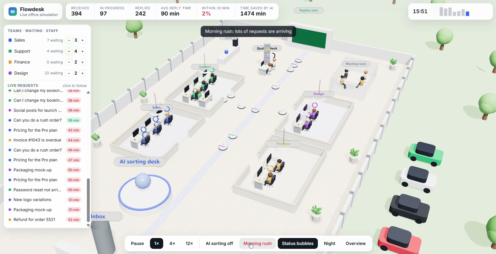
What if — AI sorting off and a morning rush: queues build and waits turn red within seconds
Where it could be used
- Operations teams. A shared screen that shows where work is piling up right now.
- Agencies selling AI customer service. A demo that shows a client how much waiting time automation removes. Teams and request types can be renamed for each business, such as a clinic, a hotel or an online shop.
- Service design workshops. A customer journey you can watch happen, not just draw.
What's next
Connect it to a real inbox or ticketing system, add a replay of yesterday's busiest hour, and test with an operations manager to see which numbers they actually check first.
- An operations dashboard you can walk through — follow any request from inbox to reply
- Queues, waiting times and workload as an office you watch, not a table you read
- Staffing and AI automation decisions you can test live
- A real-time 3D office simulation running in the browser
Flowdesk is a concept. The office, people and requests are simulated, not real company data.
Need a dashboard people can actually read at a glance?
Let's talk