UI/UX Design · iOS · Interactive prototype
Jarlo — money you can actually see
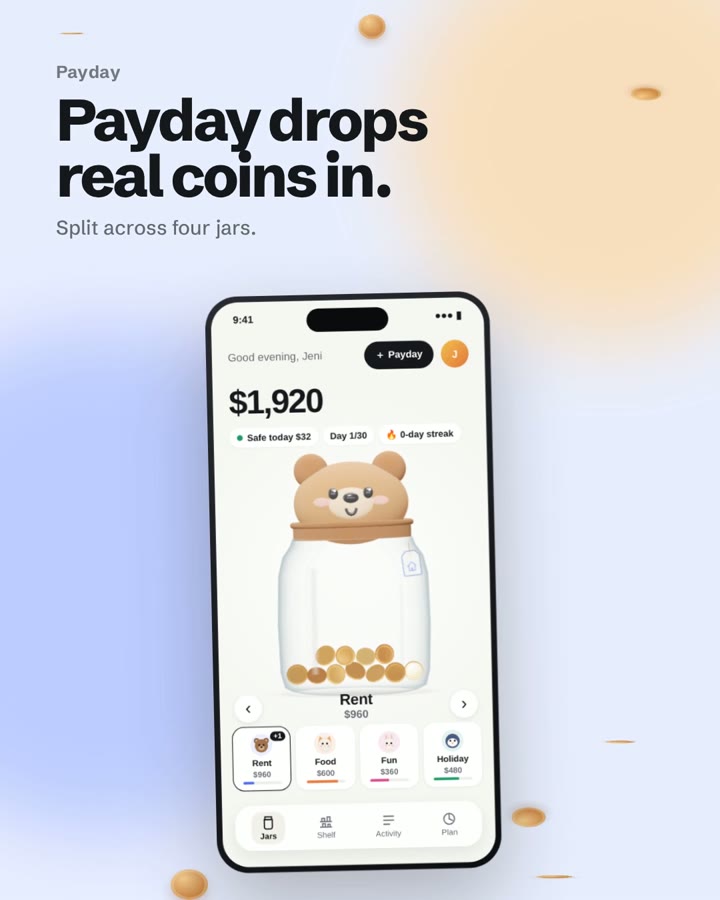
A budgeting app where every payday drops real coins into four glass jars, each with its own little character. Fill one to the lid and it joins your shelf.
The problem to solve
Most budgeting apps feel like a spreadsheet: rows of numbers, categories and charts. People set a budget once, stop opening the app, and lose track of where the money went. Jarlo needed to make money something you can see and feel, so checking your budget becomes a small moment you look forward to, not a chore.
The idea
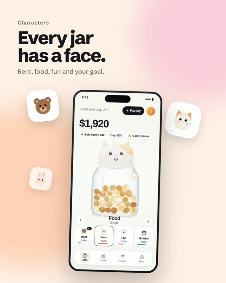
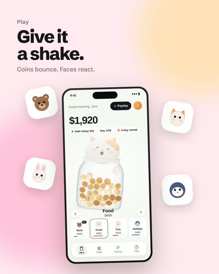
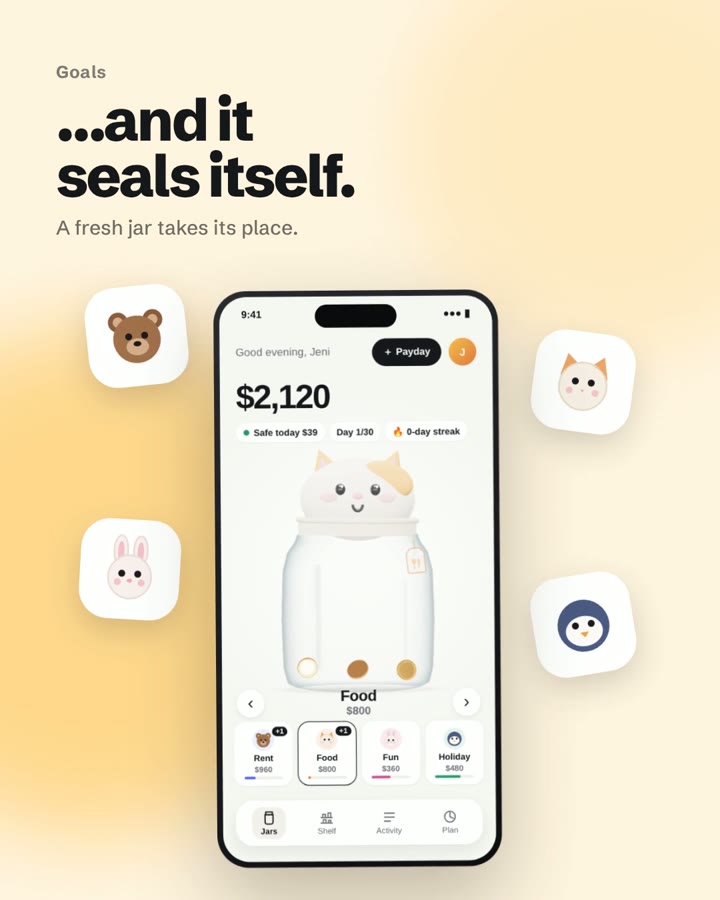
See your money, not a spreadsheet. Your budget becomes four glass jars — Rent, Food, Fun and your goal — that you watch fill up and empty out. Every jar has a character on its lid, so it reacts when you spend, save or overspend.
How I worked
- Wireframes first. Mapped the key journeys in grey before any colour: a 3-step setup, the home screen with one jar in focus, the spend / add money sheet, overspending, a jar filling up, and the shelf. Every screen got real copy and a single job.
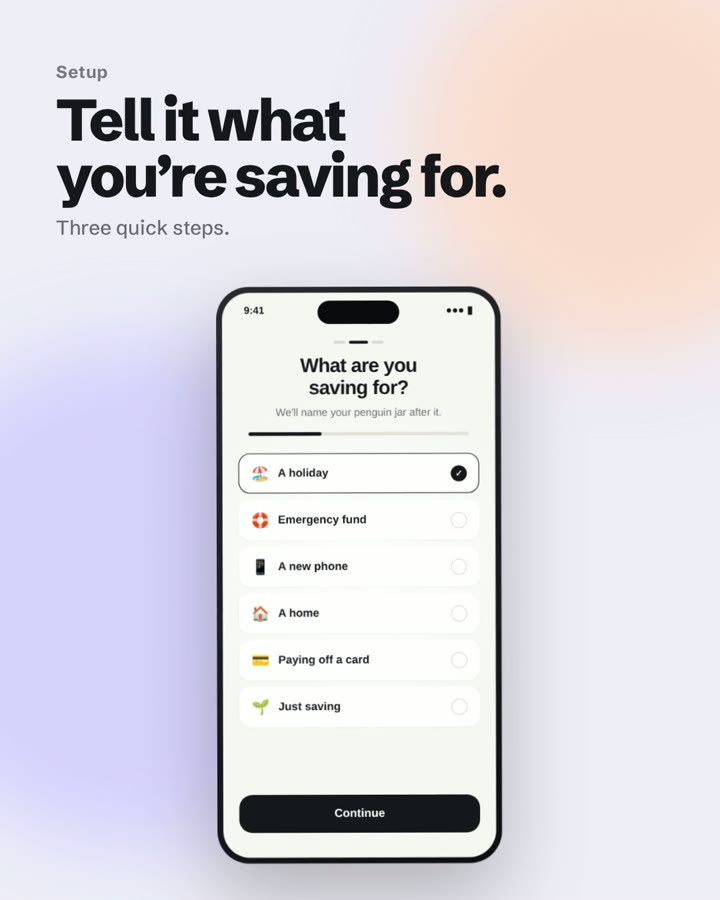
- The shortest path to the first good moment. Setup asks only two questions — what you're saving for and how much lands each payday — then "Fill my jars" drops your first coins in. The goal you pick names your savings jar.
- Design the hard moments too. When you try to spend more than a jar holds, Jarlo doesn't just block you: it shows how much you're short and offers to borrow from another jar, while the jar on Home shows a crack and a worried face.
- Prototype with real physics. Built an interactive prototype in the browser with 3D jars and physics-driven coins, so the feel of money dropping in could be tested, not just described.
- Tell it as a reel. Cut the prototype into a short reel — setup, payday, characters, play, goals, shelf — to sell the idea in seconds.
Wireframes
Eight low-fidelity screens, drawn in grey before any colour or character art, so feedback stayed on flow and hierarchy: the 3-step setup, the home screen, spending, overspending, a jar filling up and the shelf.
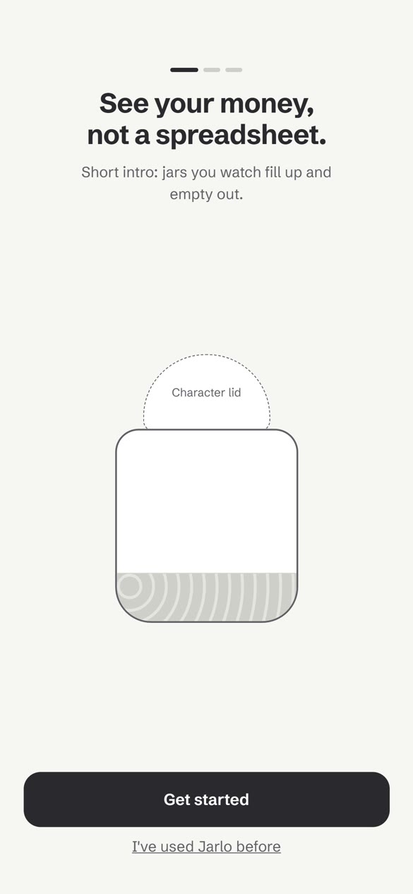
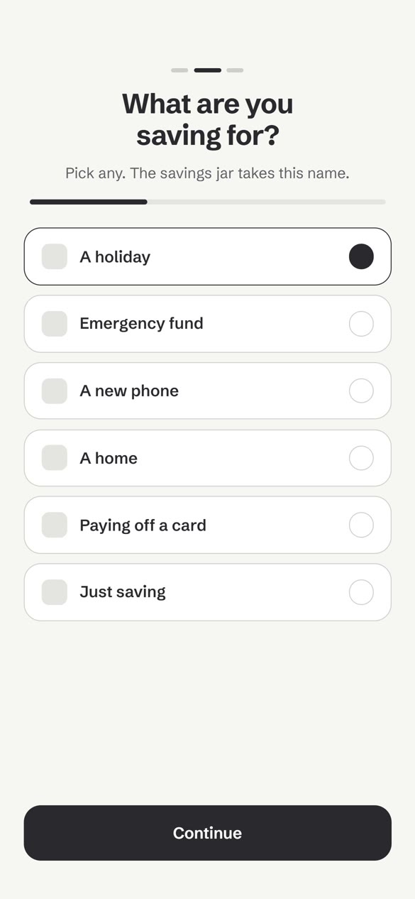
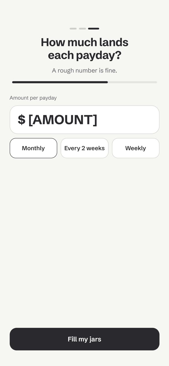
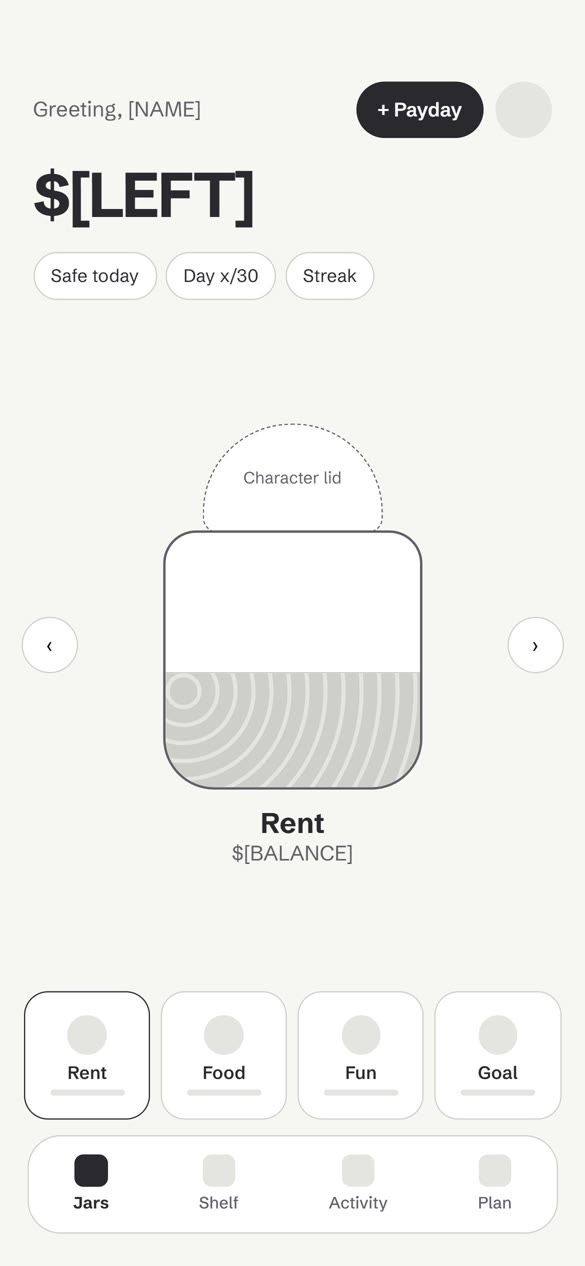
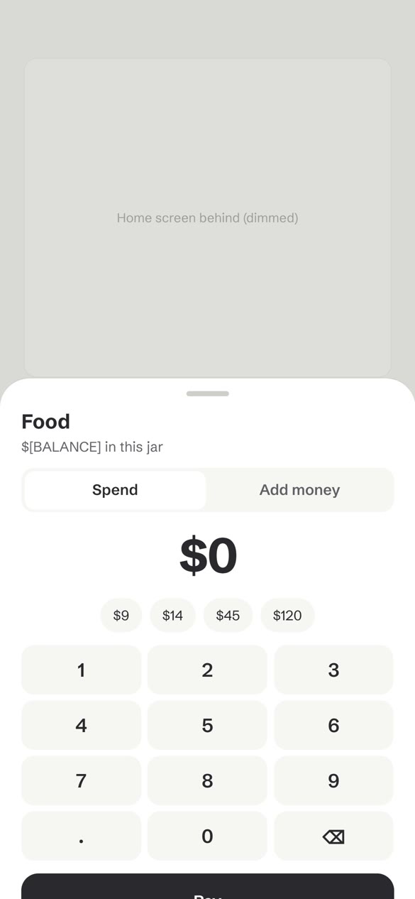
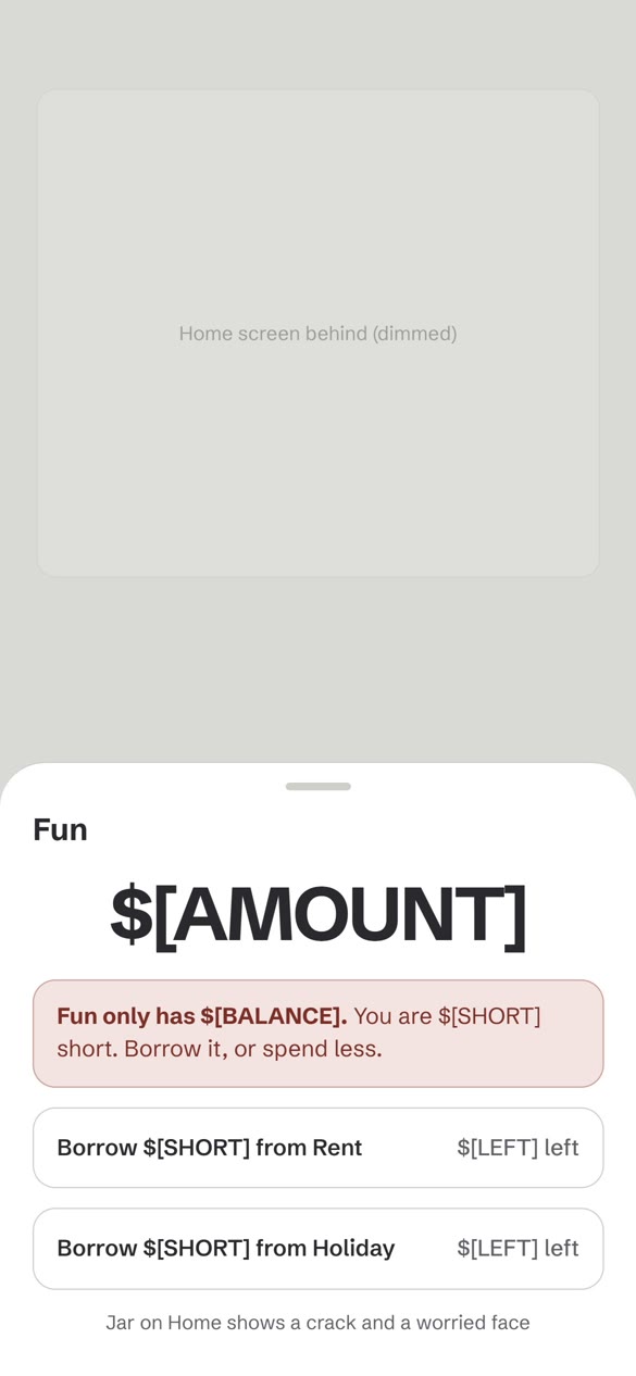
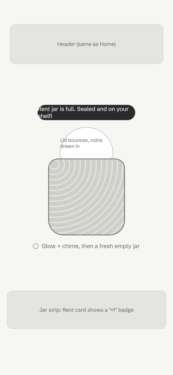
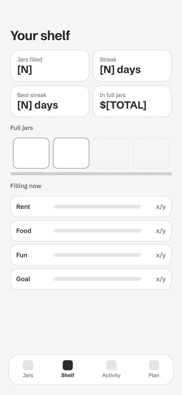
Key journeys in grey first — every screen has real copy and one job
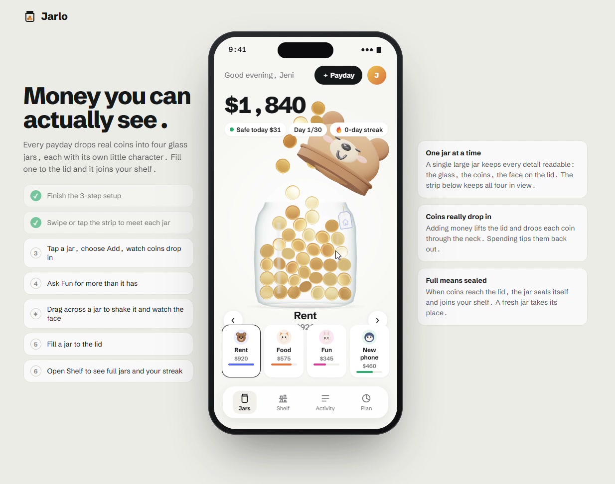
The interactive prototype — a guided checklist walks testers through every key moment
Design decisions
- One jar at a time. A single large jar keeps every detail readable: the glass, the coins, the face on the lid. The strip below keeps all four in view.
- Coins really drop in. Adding money lifts the lid and drops each coin through the neck. Spending tips them back out, so every number has a visible, physical change.
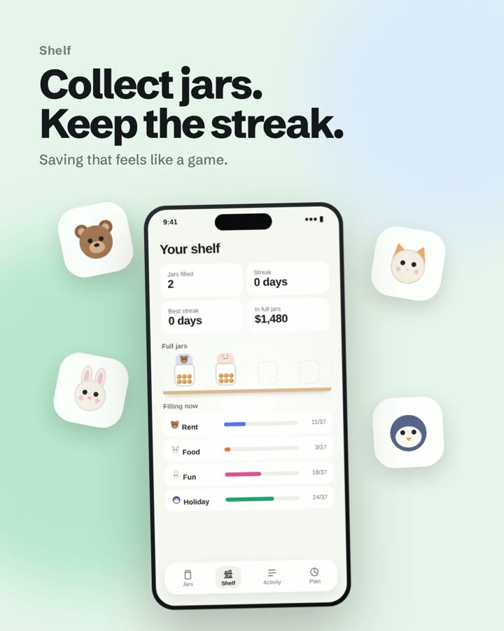
- Full means sealed. When coins reach the lid, the jar seals itself and joins your shelf. A fresh jar takes its place, so progress feels like a collection, not a balance.
- Small rewards, no pressure. A streak, a day counter and "Safe today" tell you what you can spend without doing maths, and the shelf turns saving into something that feels like a game.
Where it landed
A budgeting app that makes money visible and a little bit fun:
- A full flow from setup to shelf, wireframed first and then taken to final UI
- Four jar characters that react to saving, spending and overspending
- An interactive 3D prototype with physics-driven coins
- A short motion reel that explains the whole idea in seconds
Have an app idea that should feel as good as it works?
Let's talk