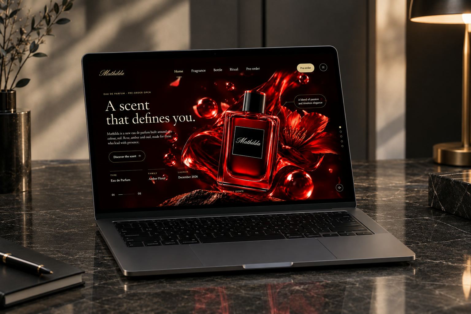
Web Design · Fragrance Launch
Mathilda
A cinematic pre-order landing page for a new eau de parfum — built around one colour, red.
Site walkthrough — five chapters, from the first scent to pre-order
The challenge
A fragrance can't be smelled through a screen. Mathilda needed a launch page that made a scent feel tangible and desirable — rose, amber and oud, told through mood, material and motion — and turned that feeling into pre-orders ahead of its December 2026 launch.
The approach
- Red and black for a premium feel. I built the whole page around deep red and black with warm gold accents. Black sets a luxurious, high-end mood; red carries the passion of the scent and becomes the brand's signature; gold adds a refined, jewellery-like finish to buttons and details — so the site feels as premium as the product.
- Tell it in chapters. Structured the page as a five-part story — Home, Fragrance, Bottle, Ritual, Pre-order — each full-screen chapter revealing one side of the product.
- Let the product lead. Large, cinematic product visuals with fine-line callouts pointing to details like the atomiser and hand-cut glass.
- Luxury typography, clear action. An elegant serif for headlines, a clean sans for details, and a persistent Pre-order button so the next step is always one click away.
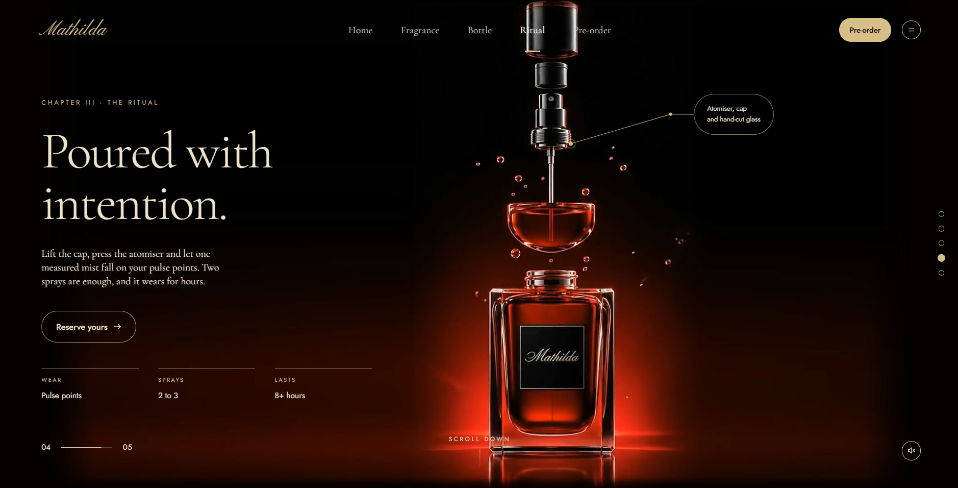
Chapter III · The Ritual — the bottle deconstructed, with quick facts on how to wear it
Workflow — design to code
The same process a professional product team follows — research, art direction, design system, prototype, hand-off, build and QA. I made the design decisions; AI sped up the parts it's good at: generating assets, and turning a finished Figma file into production code.
-
01
Brief & research
Defined the goal (pre-orders before launch), the audience and the key message. Audited luxury fragrance sites for layout patterns, tone and how they sell a scent visually. Used Claude to speed up competitor summaries and to draft copy options for each chapter.
-
02
Art direction & moodboard
Built a moodboard in Figma and locked the visual direction: red and black with gold, glossy liquid and petals, low-key cinematic light. Chose the type pairing — an elegant serif for headlines, a clean sans for UI.
-
03
The super prompt
Translated the art direction into one master prompt with Claude — a brand bible every image and video prompt was built from, so every generation looks like one campaign:
PaletteDeep red, black, warm gold — nothing elseMaterialsGlass, liquid, rose petals, droplets, stoneLightLow-key, red rim light, glossy highlightsCameraMacro, shallow depth, slow cinematic motionProductFixed bottle shape, label and logoAvoidText artefacts, off-brand colours, clutter -
04
AI assets — stills & motion
Generated the key visuals chapter by chapter from the super prompt, curating and iterating until each frame matched the direction. Then animated the chosen stills into short seamless loops — drifting petals, floating droplets, a falling mist — exported light enough for the web.
-
05
Wireframes → UI design in Figma
Started with low-fi wireframes to lock the five-chapter flow and content hierarchy, then moved to high-fi. Set up a proper design system first — colour and type styles, spacing, a 12-column grid — and built reusable components with Auto Layout (nav, buttons, spec rows, callouts, chapter indicator). Designed desktop and mobile frames side by side.
-
06
Prototype & review
Linked the frames into a clickable Figma prototype with Smart Animate to test the scroll story, transitions and pre-order flow, then refined spacing, copy and hierarchy before anything was coded.
-
07
Hand-off & build with Claude
Prepared the file like a real developer hand-off — named layers, tokens for colours and type, exported assets, and notes on motion and breakpoints. Claude then read the Figma design and wrote the production code: semantic HTML, CSS built on the same design tokens, and JavaScript for the full-screen chapters, scroll navigation, background video and sound toggle. I reviewed every section against the Figma frames and iterated until it matched pixel for pixel.
-
08
QA & launch
Tested across browsers and devices, checked responsiveness on real phones, compressed video and lazy-loaded media for speed, and checked contrast and keyboard access — then shipped.
The result
A premium, on-brand launch experience — taken from Figma design to production code:
- A luxury red-and-black look that matches the brand and the scent
- A chaptered, scroll-driven story that guides visitors from scent to pre-order
- A consistent AI-generated campaign world — stills and motion — from one super prompt
- A clear, always-visible path to pre-order
Want a launch page that makes people feel your product?
Let's talk