UI/UX Design · Mobile App
Meanwhile
UI design and an App Store screenshot set for a parenting app — calm, judgment-free tracking for the long wait before a specialist visit.
The challenge
Meanwhile helps parents track developmental observations about their child while waiting months for a specialist appointment — a stretch of time that's easy to spend anxious and second-guessing.
Most milestone trackers make that worse: scores, streaks, and pass/fail language turn a child into a chart to worry about. The brief was to design something that feels calm, supportive, and judgment-free — genuinely helpful in the wait, not another source of pressure.
The approach
- Ranges, not scores — replaced pass/fail milestones with context-based ranges ("most children reach this between 12–21 months"), so parents see where their child sits, not whether they "passed."
- Calm, judgment-free copy — every screen speaks gently ("Track what matters. Not scores." / "Nothing today — that's fine."), removing pressure and blame.
- Mapped the full app flow — wireframed the whole experience, then brought the key screens (Home, Today, Visit) to high-fidelity UI so parents can capture small moments and arrive at the appointment prepared.
- A warm visual system — built the colour, type, and iconography to feel warm and trustworthy without falling into typical "baby app" pink or gamified cues.
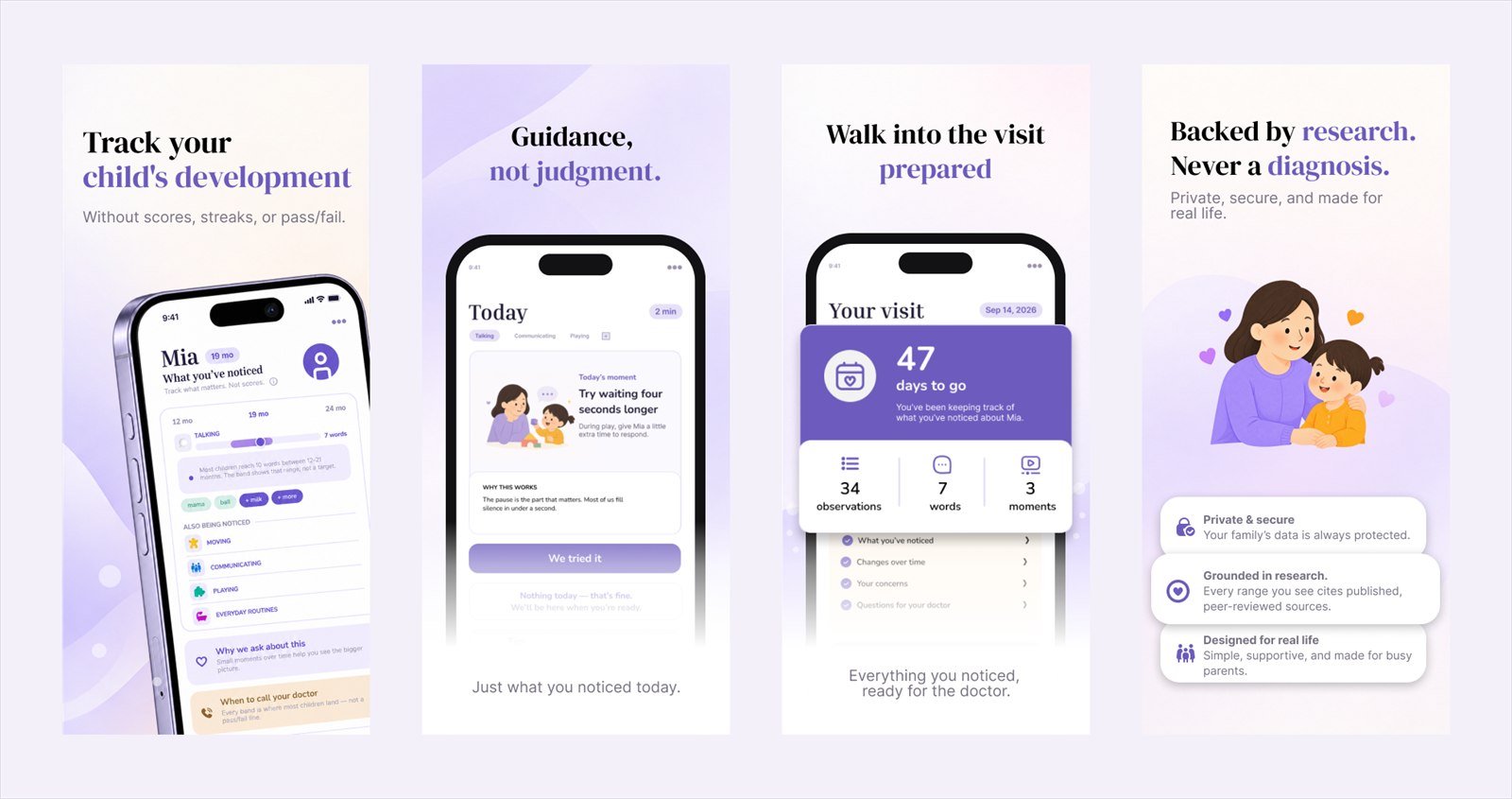
- A 4-panel App Store set — paired each key screen with headline copy so the store listing tells the story: track your child's development, guidance not judgment, walk into the visit prepared, backed by research.
Key screens
The flow's key moments — from everyday observations to a clear, prepared picture for the specialist.
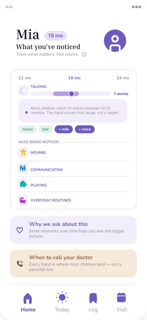
Home · ranges, not scores

Today · one gentle moment
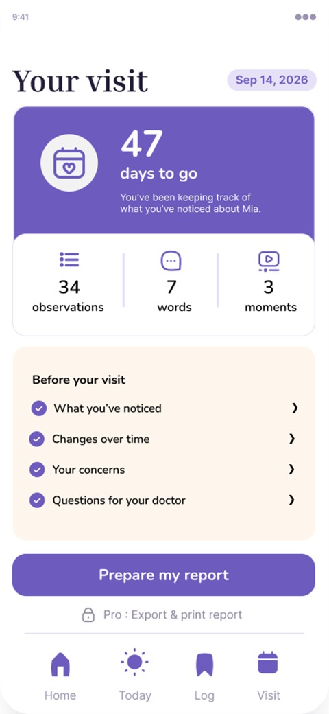
Visit · ready for the appointment
App Store screenshots, designed to convert
A store listing has seconds to work, so every panel here is a research-backed decision, not a guess — driven by keyword and competitor research, and by what real parents actually say:
- Track your child's development — the keyword. Keyword research first: parents don't search "milestone tracker," they search "child development." I led with that exact phrase in big text so search intent and headline match instantly, with the twist in the subline ("without scores, streaks, or pass/fail").
- Guidance, not judgment — the difference. After scanning competitors, I dropped the category claim (every tracker promises to "understand your child") for the one thing only Meanwhile does: gentle, judgment-free tracking — "just what you noticed today," no scores, no streaks.
- Walk into the visit prepared — the rave feature. My bet for what parents value most — turning the anxious wait into arriving prepared. I'd confirm this against real user interviews and reviews before locking the order, not just assume it.
- Backed by research, not a diagnosis — trust + a face. Credibility markers (private, research-grounded, "not a diagnosis") to reassure a cautious parent — paired with a warm human face, since faces stop the scroll fastest in a row of phone mockups. (Illustrated to stay on-brand; a real photo could push it further, and an Apple badge if it earns one.)
Each panel earns its place — keyword, difference, payoff, and trust with a face.
The result
A calm, judgment-free parenting app that supports families through the wait instead of stressing them — with a store listing that makes its promise clear:
- A judgment-free system built on ranges and calm copy — no scores, streaks, or pass/fail
- A full app flow (Home · Today · Log · Visit) with polished key screens that turn small daily notes into a prepared picture
- A warm, trustworthy visual identity that avoids clichéd "baby app" pink and gamification
- A 4-panel App Store screenshot set with headline copy, ready for the listing
Have an app that needs to feel calm, clear, and human?
Let's talk