Web Design · 3D Interactive · Concept 2026
squella
An art exhibition website you walk into, where every sculpture is soft to the touch.
The problem
Exhibition websites usually look the same: a hero image, a list of artists, opening times and a ticket button. They tell you what's on but give you nothing of how it feels to be there. For an exhibition about soft, living forms, a flat page of photos misses the point entirely.
The idea
Make the website the exhibition. Instead of scrolling down a page, you move through five rooms in 3D space. The camera glides from room to room, fog gives the space depth, and every sculpture is a soft, breathing form you can press with your finger.
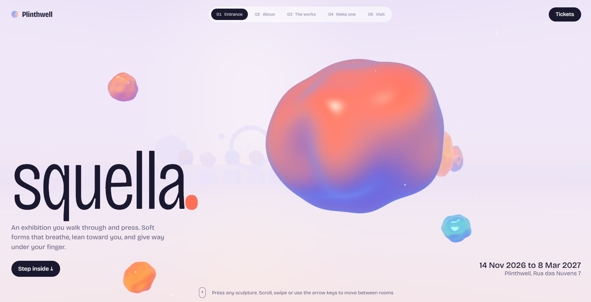
The Entrance — one room, one message, and a sculpture waiting to be pressed
From flat page to rooms
The first version was a regular scrolling page with animated sculptures in it. It looked good, but it still felt like reading about an exhibition rather than visiting one. Rebuilding it as connected rooms changed the experience from browsing to arriving.
Design decisions
- One idea per room. Entrance, About, The works, Make one, Visit. Each room holds a single message and a single thing to do, so nothing competes for attention.
- Touch you can feel. Press any sculpture and it gives way where your finger lands, bulges around the dent, then springs back with a small wobble. The squash follows real spring behaviour rather than a canned animation, so a quick tap and a long press feel different.
- Transitions that feel like walking. Text fades and softens as you leave a room, and the camera eases along a curved path rather than cutting, so moving between sections feels like stepping through a space, not loading a page.
- Play before you buy. The "Make one" room turns the artists' rules into three sliders: warmth, ripple and pulse. Visitors shape their own sculpture, shuffle colours and keep a numbered piece before they ever reach the ticket room.
- Open to everyone. It works with a mouse, touch, swipe or arrow keys, and has a room menu for jumping straight to any section. Motion calms down for people who turn it off in their device settings.
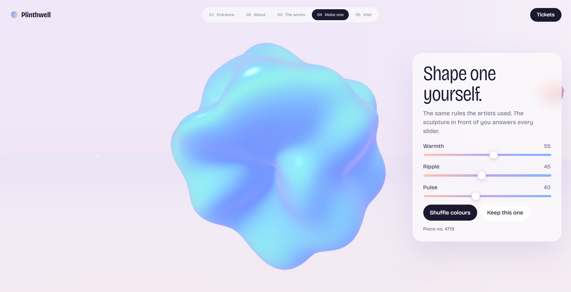
Make one — the artists' rules as three sliders, so visitors shape and keep their own piece
Typography and tone
Bricolage Grotesque, with its slightly wide, friendly forms, matches the soft sculptures without becoming childish. Copy stays short and warm: "Nothing in this hall has an edge."
What I learned
Interaction can carry the brand more than visuals can. People remembered pressing the sculptures long after they forgot the colour palette.
- An exhibition website you walk through instead of scroll — five rooms, one idea each
- Real-time 3D rooms with custom shaders and real spring physics under your finger
- Touch as the main interface: press, hold and play with the art before buying a ticket
- A visual identity built around softness, from rounded type to sculptures that breathe
squella, the Plinthwell venue and every artist in it are fictional. A concept by Issaya Design.
Want a website people remember touching?
Let's talk